When do we have overload?

Who decides in what way that the tunnel is overloaded or not?
Ideally, there should be a “load-meter” comparable to the temperature measuring stick for the Christmas goose in the oven.
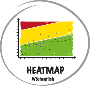
This is exactly the function provided by the heat map!

How do we create a heat map?
There are many ways to Rome, a simple and good way is to take the fever curves of the individual projects as a basis:
We evaluate the delay of the projects compared to the remaining time to the next gate or milestone – as described in the “Chart Buffer Consumption”.
We then enter the “end points” of all curves in a chart.
Projects close to completion turn red faster than those that have just started. The projects close to completion have less time to catch up and should be given management attention so that nothing goes wrong in the last few metres.
The number of red elements is the temperature gauge.

Rule of Thumb.

An organisation can easily cope with 10-20% “red” projects before multitasking, priority conflicts and desynchronisation get out of hand.
With more red projects, we first get the active projects in order before we set the traffic light in front of the pipeline to “green” again and thus fill the tunnel further.

Rules for operational prioritisation.
Prioritisation within a team can be set easily and with little effort in conclave and sprint planning.
If there are priority decisions to be made between teams or even between projects, rule-based priorities help to arrive at stable decisions: