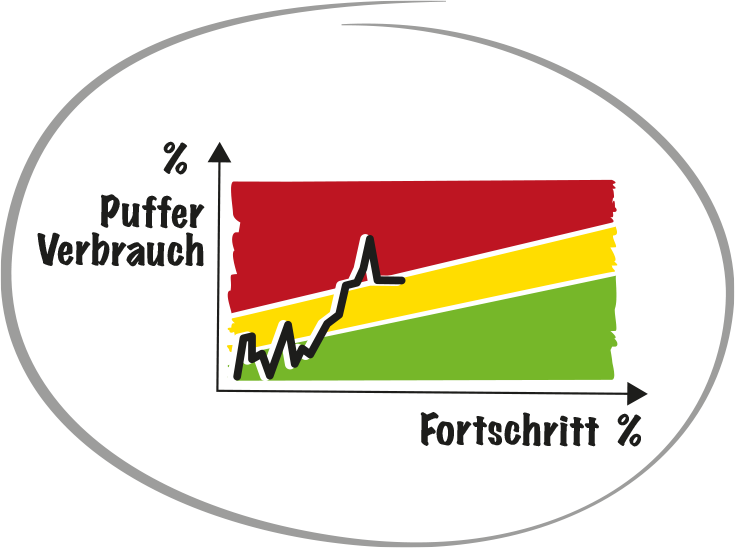
The fever curve.

If we plot the buffer consumption in % against the progress in % – and at least in every sprint – we get a trend curve that makes it transparent very early on whether this is going to be good.
This gives us the time to react in time and all levels are reminded every day that we should act.

Command and control in different hands.
The project manager in the POT creates the plan with all goals and dependencies at a high level. The middle and lower flu levels are under control of the teams with the Agile Boards.
The teams give a forecast for the “Estimated time to completion” after each sprint. The project manager can then use their planning and knowledge of what is on the critical path to determine buffer consumption and progress.
What is the plan, where do we want to go (-> Command, the “what”) lies with the POT. The estimation of how far we are and how exactly we will get to the goal is up to the team (-> Control, the “how”).

The coloured areas are asymmetrical.
At the beginning of the project, when you still have two years to go, two months behind schedule is “green”, you still have time to make up for it – but the fever curve reminds you that you have to do it. If you don’t: red is getting closer and closer.
At the end of the project, the same two-month delay is red: in two months, you won’t make up two months.

What does 100% buffer consumption mean?
It is still possible to finish on time, but it means that all remaining operations involved in the critical path must be completed in the minimum “touch time”. Everyone has to help and give the participants the best possible conditions. Think about who will provide them with the missing equipment, set up devices, order parts, answer the phone or answer emails for them.